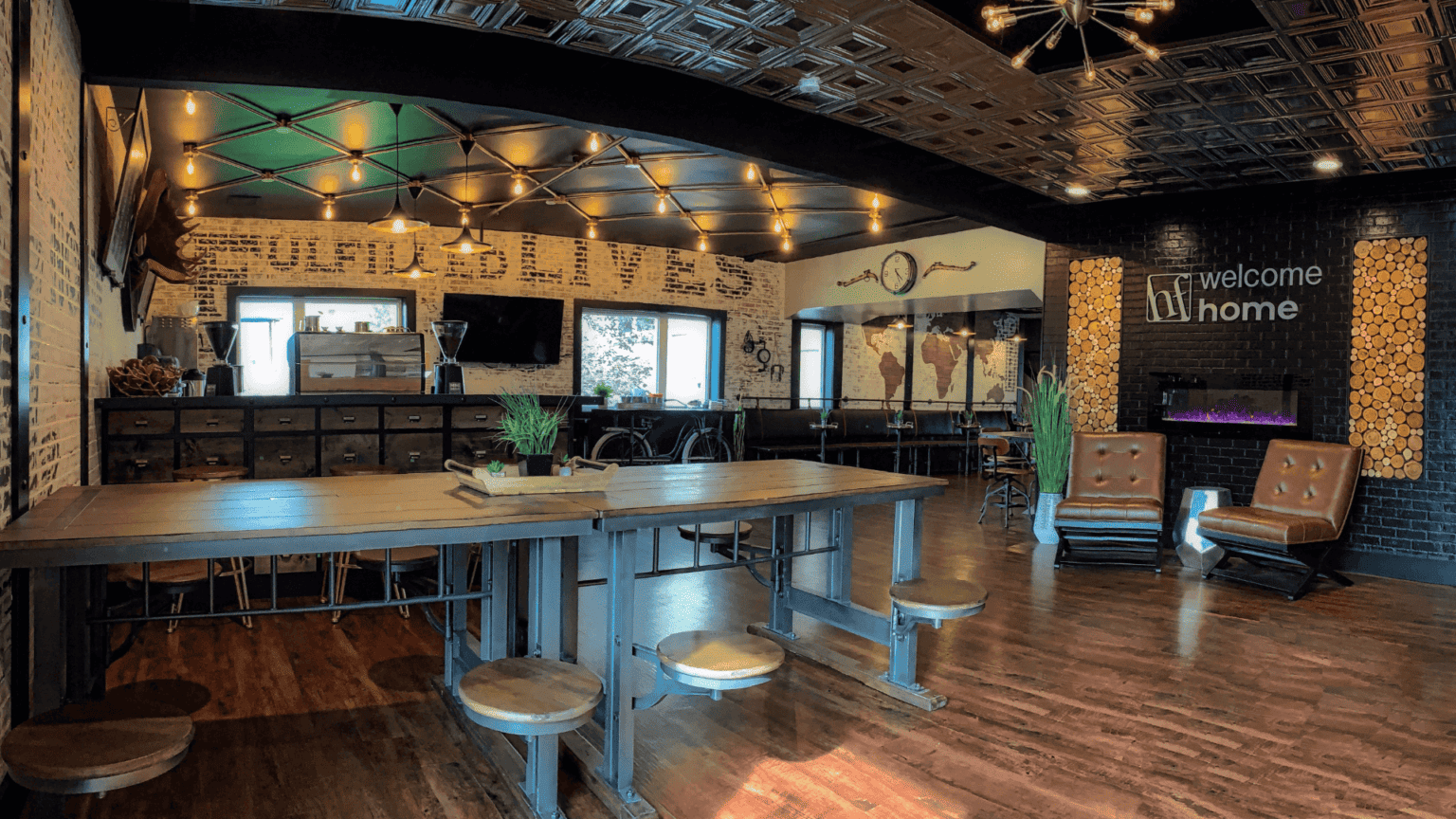
When it comes to creating a great experience for new people visiting our church, one of the most often overlooked resources is our facility. Through our parking, our lobby space, and even our restrooms, we can unintentionally create a negative or confusing experience for guests.
Fortunately, this is one area where small intentional changes can make a big difference.
I had the chance to sit down with Phil Taylor, the Executive Producer of PlainJoe Studios, to discuss the common mistakes churches make when it comes to their space and how they can design a more cohesive, positive experience.
Here are the top 5—
Mistake #1: There is no clear, cohesive experience.
When new people are visiting our church, clear directional signage is a key part of providing them with a good experience. Put yourself in the eyes of a visitor and ask: How does a visitor experience this building? Where do they need to turn? What do they need to find?
For example:
- Do they know where your building is, and where to go inside from the parking lot?
- Do they know where to go to drop off their kids?
- Do they know how to get to the bathrooms?
All of these things are simple to solve and can alleviate a lot of anxiety for newcomers. And creating this cohesive experience from the parking lot all the way to their seat is not a hard or expensive thing to do.
Mistake #2: Becoming dated and not realizing it.
It’s easy to become blind to our spaces when we’re in them all the time. New people, on the other hand, come in with fresh eyes and a different perspective when they’re engaging our facilities because it’s an experience that they’ve not had before.
If you’re staying up-to-date and planning for it ahead of time, it doesn’t have to be overwhelming. There are easier (and cheaper) solutions to refresh and update your space without updating the whole building:
Say every 5 years or so, you change out the accent colors, the vinyl signage, and the hanging wayfinder signage, etc. Then every 15-20 years, plan to make major changes.
At this free 1-hour webinar, the Unstuck team and guests Derwin Gray, Jonathan Smith, and Rick Atchley will help you clarify the next bold move God may be calling your church to make—and unpack the next steps to get there.
Mistake #3: Not thinking about “placemaking” in your building.
Placemaking means: What am I going to learn about your church by just walking around the common spaces—the lobbies, the hallway to the kids’ ministry check-in area, the furniture, etc.?
People walk into a space and have a sense of who you are as a church. And if we want to refer to our church as a home, there needs to be some touches of a home around.
Buildings need to be functional and serve a certain purpose, but you’re also trying to create a certain emotional reaction in the space as well—whether that be a graphic or a phrase that communicates what the church values, or a big colorful and beautiful kids’ check-in area that communicates that kids are important.
Mistake #4: They have over-built or under-built.
There are a few major areas where churches run into capacity issues:
- Seats available in the sanctuary.
- The capacity of the kids ministry.
- Spaces in the parking lot.
- The capacity of the lobby.
More often than not, churches will overbuild the sanctuary and under-build everything else… but overbuilding your sanctuary can also have a huge impact on morale. On the other hand, you have to have a plan for how all of these key spaces could grow in the future as your church grows.
Tip: Think about how the size and set up of your lobby impacts people’s experience of your church both entering and leaving, and prioritize that space.
Mistake #5: Not having a story drive your design.
Every good story has three clear aspects to it:
- Setting – Where are you in the world? What’s happening around and inside your church?
- Characters – Who are your members, and who are you trying to reach?
- Plot – What’s your purpose?
When we understand the story, we can go from there into all the different aspects of design:
- If your church is traditional and you’re in a community that values tradition, that should be reflected in the design of the building.
- If you’re a church that values innovation, that should be reflected in the use of technology in your building.
Your story will be your roadmap for any changes made in the future. If you’re not holding to a consistent story, then your space will quickly start to feel disjointed.
Listen to our podcast episode with PlainJoe Studios.


